HELLO EVERYONE!

I'm going to bring you through my thought process of how I create my layout.
I started with a piece of patterned paper from Bluefern Studios. I really LOVE LOVE LOVE their papers cos it's really thick, the grammage is higher than most of the brands out there, make it really nice to use with mediums as the paper will not warp so easily.
 |
| SEE HOW PRETTY! Had a dilemma which side to use. |
Anyway, so I chose the side on the right coz the pattern is less 'busy'. I also began to think of how I can reflect the neatness given in the Meili Paperie picture. I decided to pull out my hexagon triplits dies by Sizzix and die cut them using my Big Shot Machine.

The thing about hexagon is that no matter how messily you arrange them, as long as the edges match, they'll still look orderly somehow cos they are symmetrical. So this is the direction I am going as I'm not a orderly person, I'll probably never be able to come out with something as neat as the umbrellas in the picture so this layout will be what I call 'the neat meets the messy'.

I die cut out some hexagons with printing paper so to figure out the placements of things, and I realised I probably need a more striking background for contrast so I mixed some Kaisercrafts acrylic paints with my Teresa Collins Modeling Paste and just swipe them over the paper with my palette knife so as to create some texture and some dimension. I also splattered some dylusions ink over top in Vibrant Turquoise and Pure Sunshine colour.
 |
| So the colours I used were tropical water and mango. And it looks like this after it dries 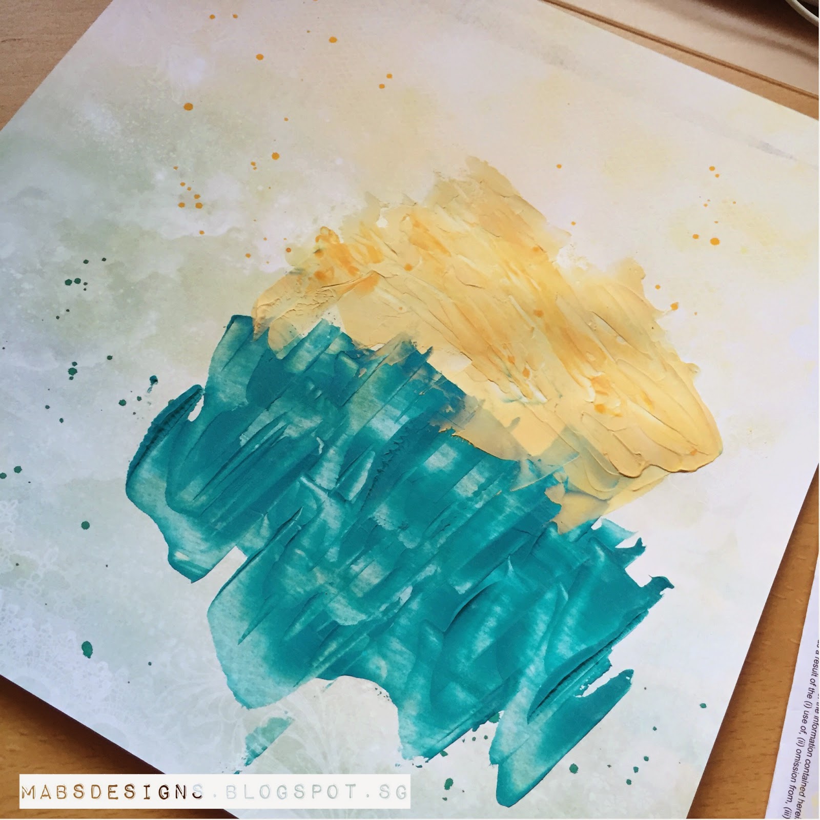 So I tested out the placement again. |

Then I started choosing my papers and die cut them. I layered my photos with some patterned papers and noticed I change my placement of hexagons? Haha. I guess I just any how mix and match and I didn't bother to follow the one I placed before. I also pop some of them up with dimensional adhesives and die cut some extra hexagons with glitter papers. I also added some stars wood veneers and dew drops by The Robin's Nest.

Originally, I had planned to stick the blue hexagons to the blue area and yellow hexagons to the yellow area as it makes much more sense looking at the umbrella picture cos it'll look neater. But after testing out the placement, I realised that if I switch them, they would stand out more as there's a contrast. I guess this is also part of my 'messy' personality. Haha.
Here are some of the close up looks:


Sorry I can't remember where these papers are from cos they're too old. They have been in my stash for too long.
To add some details and highlights, I used my fingers to gesso the borders of my photos, and then I decided I should do the same for some of the hexagons and stars as well.

I also decided to add Tim Holtz Distress Stickles Clear Rock Candy to the modeling paste at the background to add some shine to the project. I thought that the blue modeling paste is sorta mimicking the sea and the yellow modelling paste the sand. So by adding stickles to it, it creates this kind of grainy shine to it and I thought it makes the sea and sand more genuine. I would have used clear gel if I have for the sea, and white sand texture paste by Finnabair to make it even more realistic if I have those supplies. Oh well, I need start saving up since I wanna get a lot of new things. Haha.
 |
| See the shine in the blues??? So pretty. :)) I have also decided to use Heidi Swapp embellishments for my sentiment since Meili Paperie is giving out Heidi Swapp items as prizes. Fit the theme eh? 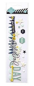
I decided to cut them down so that they'll fit my layout and I took the rest of the stars and hexagons stickers in the pack to decorate my hexagon clusters.

I then decided to trim off the top of the blue fern studios paper and layered it with a kraft cardstock at the bottom. Before I stick it down, I tore off the edges of the paper and using my Tim Holtz mini blending ink tool with the Vintage Photo colour, I distressed the edges of my paper. I also added some dotted lines with my white pen on the kraft cardstock as finishing touches.
THEN...TADA!!!
This is the final look of this layout for the Meili Paperie Competition.

I hope I get to win this competition. Haha. And I also believe this is my first time taking up a scrapbooking challenge.
Thanks Meili Paperie for the chance and also giving the inspiration to create this layout. :)
The details of the competition are (copied directly from the blog haha):
- You can submit ANY kind of project that you were inspired to create such as layouts, cards, project life fillers
- The winner of the prize will be randomly drawn and our 3 favourite layouts be featured on the blog.
- Our challenge will run until November 4th at 11:55pm Hong Kong time.
- Link your creation below by entering a link to your blog post or online gallery sharing your work. Our InLinkz now has the ability to link your project from Instagram! so you can just snap a photo of your project and link while you share it on instagram.. so cool!
- Please no back-linking. This is for newly created projects only. Any back-links will be be disqualified.
- If you don't have a blog or online gallery, alternatively you can post a photo of your work on our facebook page. Please make sure you include " Mei Li Inspired by... Challenge" somewhere in the post.
And to go to their page, just click here.
THANKS FOR READING!
See you guys soon! :))
|


-18492-31.jpg)


